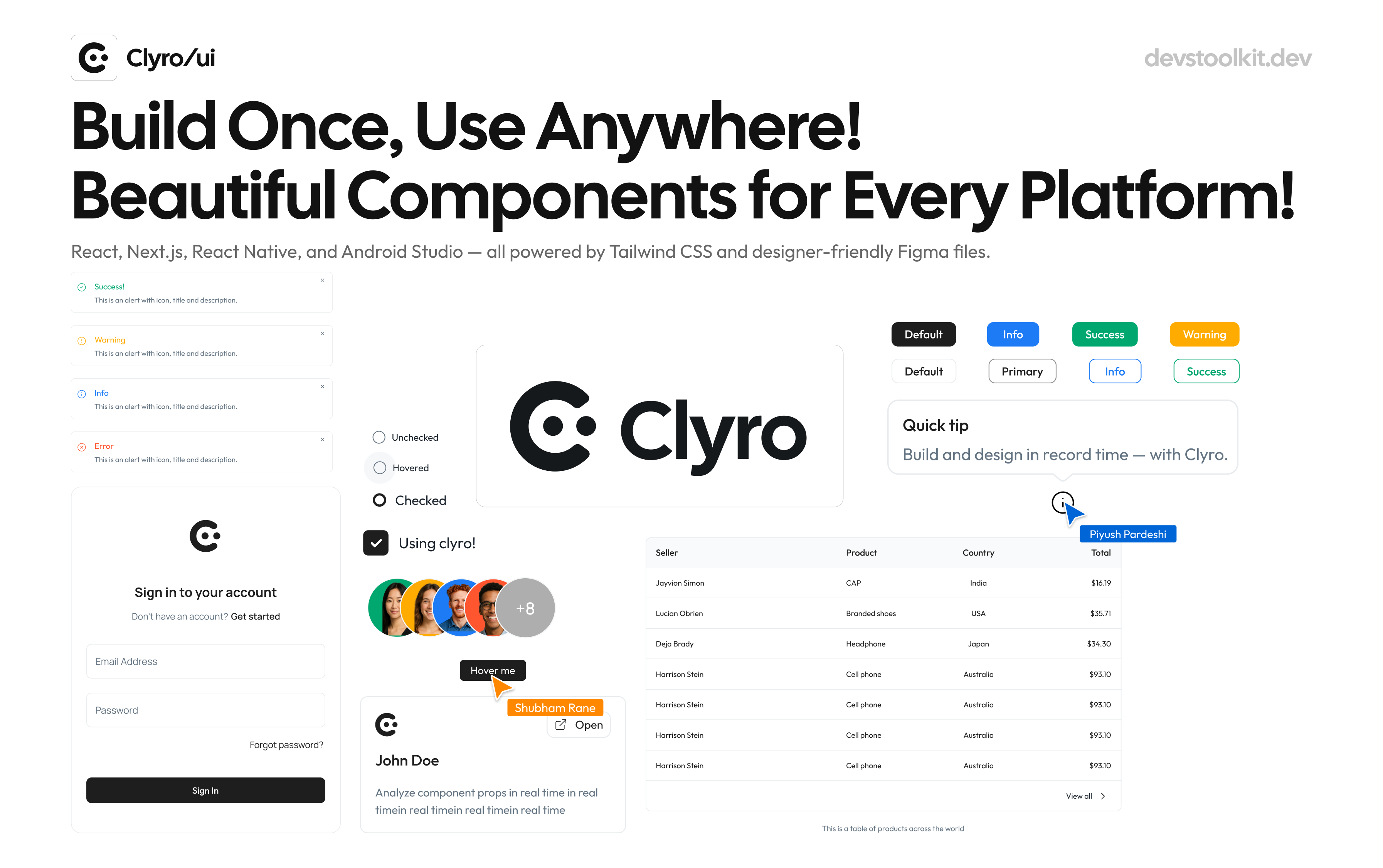
Build beautiful interfaces, everywhere
Clyro is a modern UI component library for React, Next.js, React Native, and Android. Design once, implement anywhere — perfect for cross-platform development and scalable design systems.
Free, open-source, and built for developers and designersTrusted by fast-growing companies around the world
Unlock Seamless UI Development for React, Next.js, React Native, and Beyond
Powerful and reusable components designed to accelerate your development for React, Next.js, and React Native. Simplify UI creation and streamline your workflow.
Flexible UI Components for All Platforms
Integrate customizable UI components for React, Next.js, React Native, and more (Android Studio coming soon).

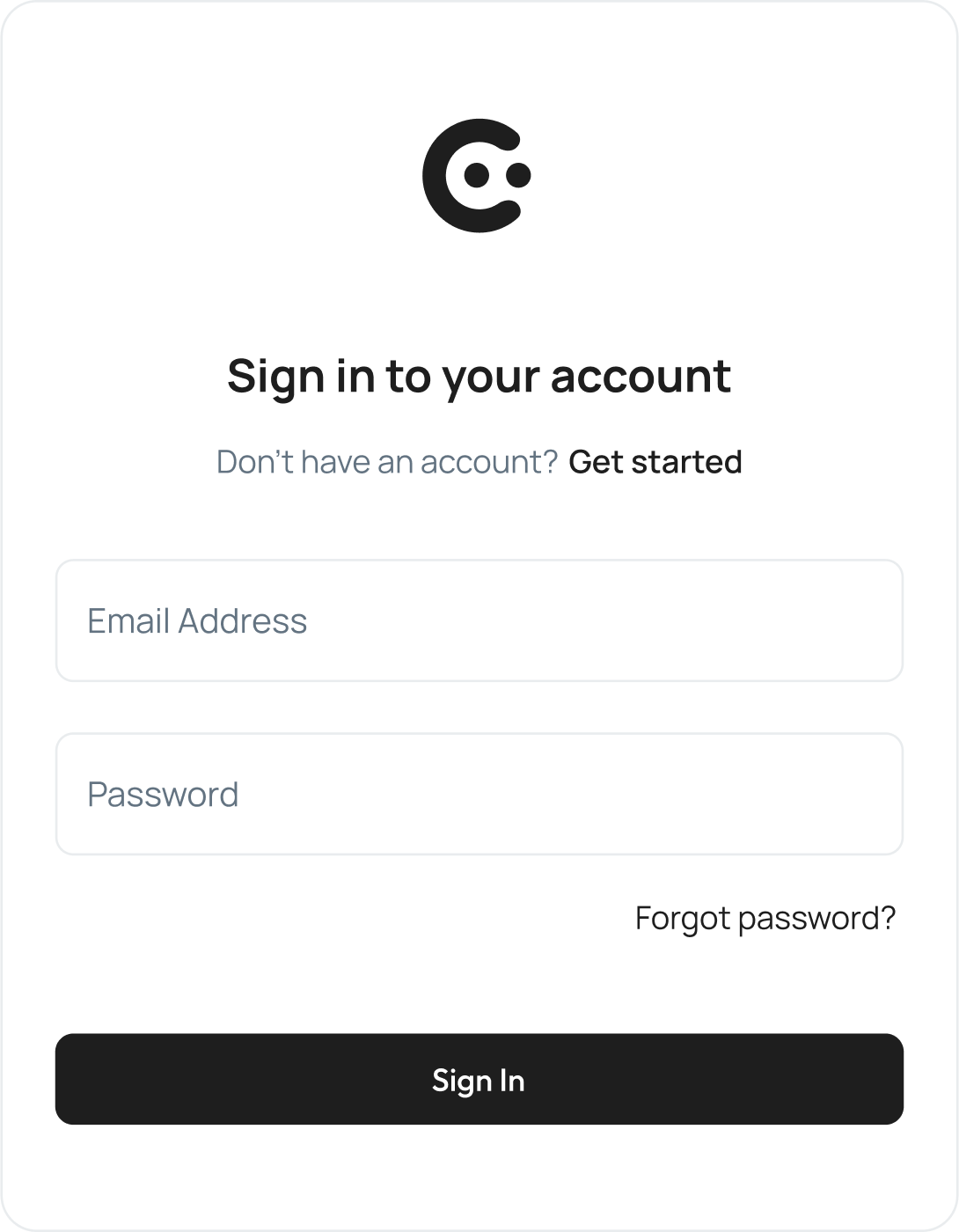
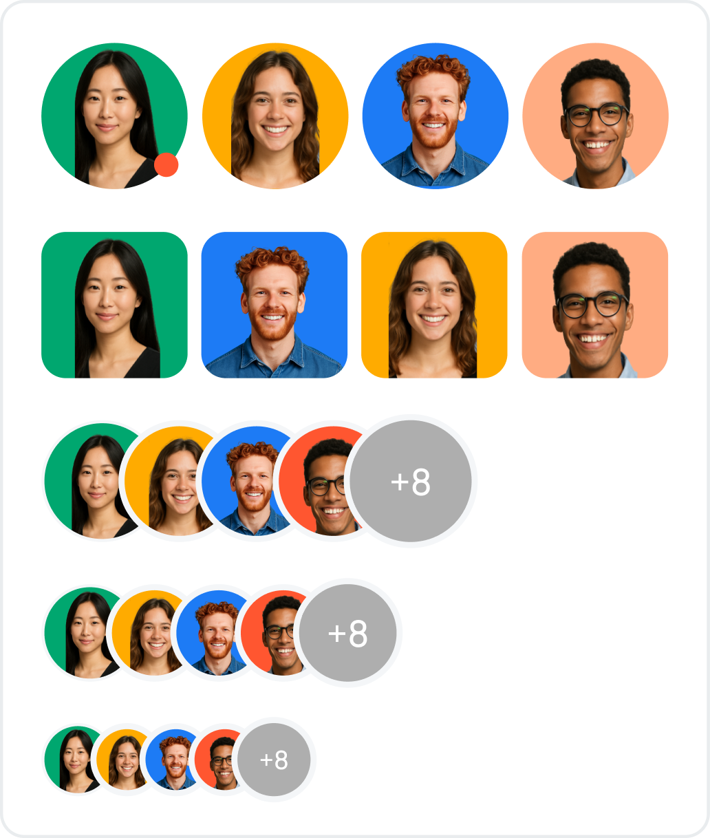
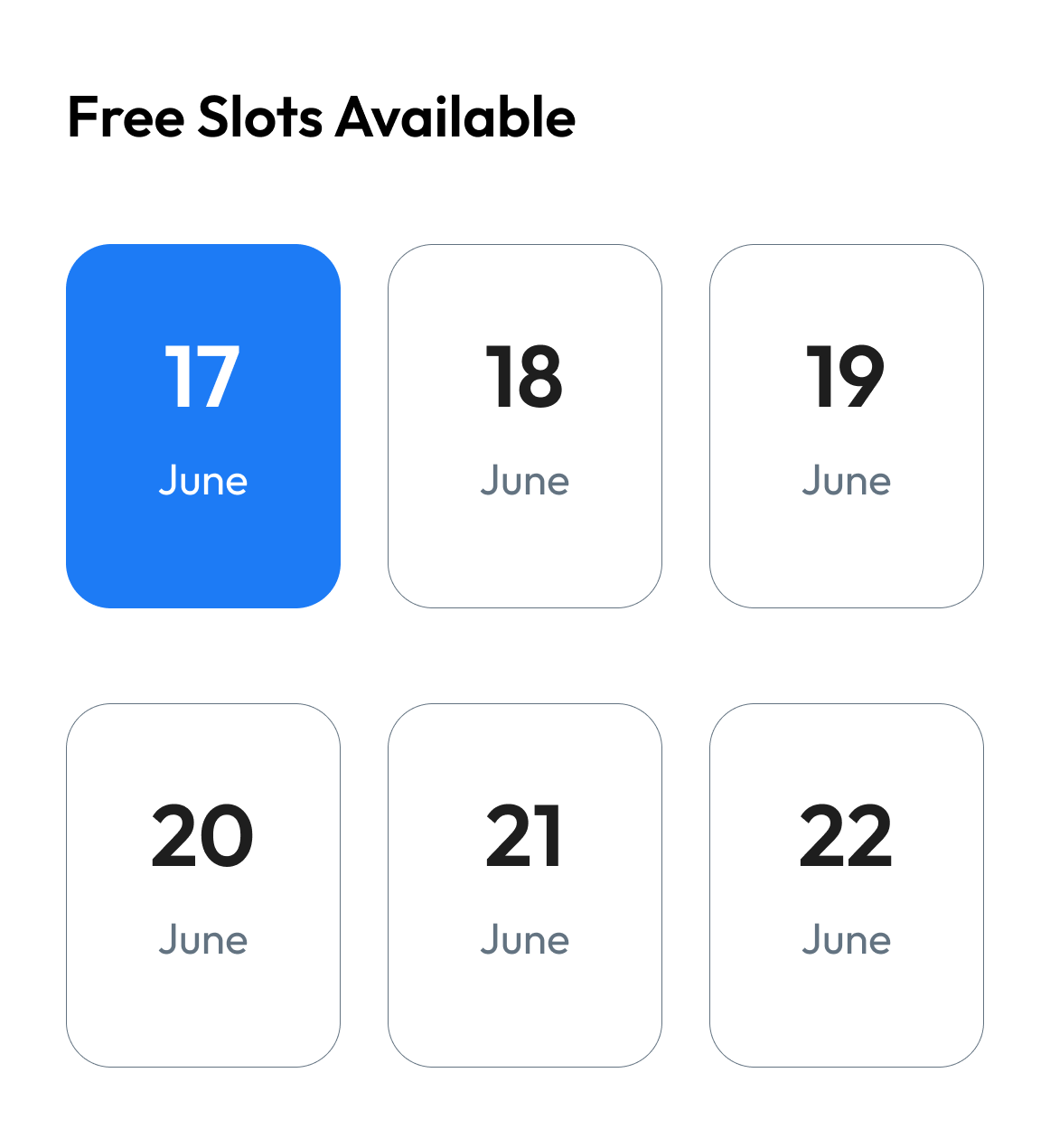
Over 30+ Customizable Components
30+ reusable, fully customizable components to elevate your project’s UI design and functionality.
Access Figma Files for Easy Collaboration
Collaborate easily with Figma files for all components, ensuring design consistency across teams.


Build beautiful, consistent UI fast
Clyro is a unified design + dev component library for React, React Native, and Figma. We help teams ship faster with perfectly synced components across platforms.
PixelShift: The Simple, Free Solution for Responsive Testing
Pixelshift is an open-source tool designed for effortless responsive design testing. It allows you to preview and adjust your website's layout across multiple screen sizes and devices, ensuring consistent user experience and perfect alignment. Save time and ensure cross-device compatibility with Pixelshift's easy-to-use interface.
TrueTone: Perfect Color Contrast for Your Website
TrueTone helps ensure your website's color contrast is accessible and visually appealing across all devices. Quickly check your color combinations and optimize your design for better readability and user experience.
PixelShift: Multi-Device Preview Extension for your browser
PixelShift allows you to preview your website on over 50 devices, ensuring it looks flawless across all screen sizes. It helps you save up to $50,000 annually compared to alternatives. Plus, it's open-source, so you can customize and contribute to the project.
Learn more
Desktop
·1200 x 900 px
Tablet
·1200 x 900 px
Mobile
·1200 x 900 px
Open-Source Tools – Contribute Today!
All the tools featured here are open-source, and we welcome contributions from anyone who wants to help improve the project. Whether you're a developer, designer, or enthusiast, your input is valuable. Together, we can make these tools even better for everyone.
Learn more and contribute